List-O-Rama/Cover Chat: 7 Stand-Out Early-2013 YA Cover Designs
I spend a fair amount of time snarking on covers that just don’t do it for me, so I thought I’d spotlight a few upcoming covers that rock my world. I thought I’d focus on young adult covers, since that’s that category that seems to have the worst case of same-old, same-old in terms of cover art.
It seems like publishers are finally moving away from the frothy dress/lots of hair covers, doesn’t it?
Paper Valentine by Brenna Yovanoff
Paper Valentine by Brenna Yovanoff (Razorbill, Jan. 2013)
I don’t really understand what this book is about, but I will be buying Paper Valentine—in paper form, and I’m a pretty dedicated digital reader—even though it sounds like it’s not my normal thing. The cover artwork is just that gorgeous and eye-catching. I would usually hate the title’s type treatment, but it works with the intricate details of the papercut-style graphic. It feels mysterious and is more mature than a lot of YA covers (all of Yovanoff’s books have had covers I’d label as “sophisticated”).
Teeth by Hannah Moskowitz
Teeth by Hannah Moskowitz (Simon Pulse, Jan. 2013)
Even though I—once again—don’t really understand what this book is about (an early review mentioned an f-bomb-dropping mer-boy) but I love the striking cover featuring fish hooks. While I’d prefer the author’s name be larger (it’s hard to see on a screen), I forgive that because the textured background is so unusual and eye-catching. This is one I’ll probably check out as well based only on the intriguing cover art.
Legacy of the Clockwork Key by Kristin Bailey
Legacy of the Clockwork Key by Kristin Bailey (Simon Pulse, March 2013)
Simon Pulse generally has some of the better covers in the YA world—they often have a distinctive touch that makes them stand out on the shelves. There are so many things to love about the cover of debut author Kristin Bailey’s Legacy of the Clockwork Key: the tone-on-tone steampunk gears around the top edges, the use of the Mathilde (or at least what looks like Mathilde) for the author and series text, the strong title type and the London skyline all really create a wonderful feel for what the book is about. Also, I love that they put the series name and book number on the cover—more of this please, some of us get confused about this stuff.
How to Lead a Life of Crime by Kirsten Miller
How to Lead a Life of Crime by Kirsten Miller (Razorbill, Feb. 2013)
I love everything about the cover of this unusual-sounding novel by Kirsten Miller, author of the popular Kiki Strike series. The crumbling brick wall, the noir-style author name and the title treatment all have a fabulous blend of retro-meets-modern design. Plus, the color combination isn’t drawn from the Pantone colors of the year palette like 50% of YA covers. Let’s have more of this timeless look on covers, okay?
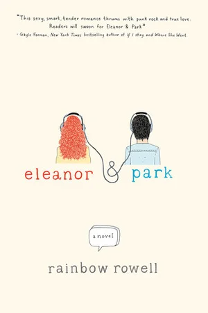
Eleanor & Park by Rainbow Rowell
Eleanor & Park by Rainbow Rowell (St. Martin’s, March 2013)
I loved the cover of Attachments, and Rainbow Rowell scored with her second novel’s cover as well. While it has a YA flair, it also will sit comfortably next to Rowell’s adult novel with its hand-lettered, hand-drawn style. St. Martin’s seems to do some really nice YA covers (This is Not a Test is one that stands out) so I’m not surprised to see this from them.
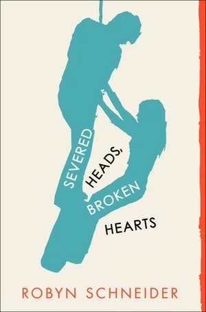
Severed Heads Broken Hearts by Robyn Schneider
Severed Heads Broken Hearts by Robyn Schneider (Katherine Tegan Books, June 2013)
I am in love with everything in the design of Severed Heads Broken Hearts. It’s minimalist without being dull, it makes great use of color and I love the silhouettes. I’m on the fence about reading this one for reasons that shouldn’t matter, but I may have to check it out just to support awesome cover art.
Infinite Sky by C.J. Flood
Infinite Sky by C.J. Flood (Simon & Schuster UK)
I know it’s kind of mean to put a book with a cover this gorgeous on this list that doesn’t have a US release date, but isn’t it lovely? The longer I look at the more marvelous details I discover: barbed wire in the title, the butterfly in the cobweb, the details in the corn—it all intrigues me. I’m particularly intrigued because it sounds like this novel features Travellers, and since I lived in Ireland, where that group is from, I’m interested in reading this book.
I didn’t realize how much I like aqua covers until I made this list, but that color really pops, doesn’t it? I’m loving that there are more artistic or graphical covers popping up because I think they’re more marketable to diverse tastes. I am so weary of YA novels’ covers that seem to be designed to appeal to a very specific sort of reader—covers shouldn’t be limiting.
Have you seen any appealing upcoming cover imagery? I want to find more books I can judge by their covers!

Gift Guide: Books for Home Cooks


